Thursday, July 29, 2010

Boxing isn't the only place for punches: beginner scrapbookers can receive them as gifts!!


Do you know what makes me happy?  Scrapbooking (okay, scrapbooking while drinking wine and sitting on the couch next to my Sugar Pie).  Do you know what makes me jump up and down and clap my hands like a little girl?  Receiving scrapbooking supplies as gifts!  So imagine my delight when Matt's mom, Marsha, surprised me with not one, not two, not three, but FOUR punches.  I had used punches at the Scrapbook Expo back in May but they weren't the kind with levers and were pretty hard to punch.  They're also pretty pricey.  Ipso facto, KeKe no buy-o no punches.  HowEVER, KeKe receives punches like no other (perhaps I should be a cagefighter). 

Marsha is either: a) a secret scrapbooker; b) a seriously talented bargain shopper; c) extremely generous; or d) all of the above.  Ooh ooh!  I know, pick me, pick me.  She's "D" all of the above! 


The punches Marsha found for Miss Hannah and I to use were at Marshalls and literally a fraction of what you'd get them for at Michaels.  The kind she purchased were by Martha Stewart and have a lever on them -- making the punching very easy on your hands. 

So it just occurred to me that we have three very similar words in the above paragraph: Marsha, Martha, and Marshalls.  Coincidence?  I think not.  When this trio comes together, the stars align for some serious scrapbook pages.

Punches come in a variety of shapes, which makes for supercallafragalisticexpialembellishments.  These flowers were made using paper flowers (from Scrapbuck.com) and the punch shown above. 


Punches also come in patterns so that you can make cool borders around your photos.  (Also try trimming all around your main 12x12 page for a fabulous effect.)


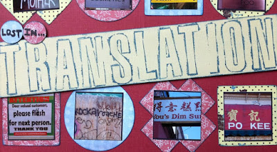
I used this type of punch to make a fancy border for some fun photos of Matthew and I at the fair last summer.  I got the puncher a little too close to the green and it made some holes that I didn't want to be there... so I covered them up with blue rhinestones and presto-perfecto!  (Edger punches are a bit like using stamps... practice makes perfect, so try them out on some scratch paper first.)


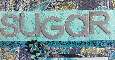
For the title, I used chipboard letters by K&Company -- also purchased on Scrapbuck.com (for a whopping $1.50).  At that price, you can purchase a bunch of them rather than spending a bajillion dollars on a die cut machine, which by the way, requires you to also purchase cartridges for all the different fonts.  Way.too.expensive.for.KeKe.


I also chose to do journaling on a secret tab that I secured by placing it between the silver and blue photo mats (this means when you're gluing the mats together, leave a little space where there isn't any glue so the tab can slide in). 


What's written on the journal tab is between me and my Sugar Pie, but let's have a closeup of that ass-grab one more time for good measure:


Thank you Marsha, for the fabulous gifts and for actively contributing to my scrapbooking addiction.  ;-)  BTW, Miss Hannah absolutely loves them, too.

Now go forth and punch! 

Tuesday, July 27, 2010

Inking Edges: Stamp-free, ink-initiation for beginner scrapbookers.


Inking the edges of your photo mats can add a nice finishing touch.  Here are some things I've learned about ink:
  • Ink pads don't necessarily only accompany stamps... I use ink pads often without bringing out the stamps.  Stamps are tricky, mean little buggers.  They look awesome but require lots of skill.  More on that in a minute.
  • Ink pads are cheap and come in tons of colors.
  • Ink is messy, messy, messy... so make sure to watch what else you touch and wash your hands --- otherwise you'll end up with smudges and smears.  Boo to smudges!
So without further ado, let me introduce you to this beginner scrapbookers take on "inking" techniques.  Inking the edges of the colored mats on this page gives it a nice popping-effect, especially in the case of red on red.  At the time I made this layout, I didn't have black ink (well, I bought an ink pad that looked black, but it turned out to be purple), so I used blue instead.  Gosh I'm good at improvising!

What you do is press the edge of the paper directly onto the ink pad.  This is going to give you a nice thin border of ink.  If you want the "sprayed" look (see below), gently press the surface of the paper onto the pad.  You can use your fingertips to press the paper onto the pad... light pressure for a bit of color, more pressure for more dramatic color.


I highly recommend testing this out a few times.

I also highly recommend waiting to adhere your photos until after you ink the edges.

Here's a close up of the title, which I stamped with individual letters...


I'd like to publicly congratulate myself on this majestic title.  It took me six (I'll repeat that: SIX) times before I got it right.  Stamps are soooo cool looking and in theory they're easy (especially now that they have clear stamps that you temporarily adhere to a clear block, making it easier to see where the image is going to end up).  So yes, how hard could it really be?  Well for me, the challenge comes in not knowing how hard to press and not knowing whether the ink will be even. 

Pleeeeease practice before stamping!  Impatient KeKe doesn't believe in looking before you leap.  Many-a-time I've skipped the directions on the hair dye box that suggest testing out the color on an "unnoticeable" strip of hair (consequently ending up sporting a hat for a few weeks).  But when it comes to ink and stamps, practice makes perfect.

Beginner scrapbooking tip:  Try making a layout using photos that don't have any people.  This layout is a compilation of photos (most were taken downtown San Francisco) that have funny sayings or misspellings.  You could do a layout of pictures of things you collect... I'm thinking about doing a layout of all my stilettos. =)

Monday, July 26, 2010

Angle-licious! Tilting your way to beautiful beginner scrapbooking layouts.


Remember how I said asymmetry is the new black?  Well, I meant it.  And tilting is the new asymmetry.  Are you confused yet? 

Here's the beauty of asymmetry and tilting: they can make a layout look really fancy and you don't need to use a lot of embellishments in order to get a really dynamic look. This tilted layout idea was suggested in 52 More Scrapbooking Challenges.

For this layout, I used one large piece of brown paper to mat all three photos.  The photos themselves are aligned straight on the brown paper, but the brown paper is tweaked just a bit on the pink paper.  To compliment the angle of the brown paper, I snipped off long skinny triangles. 


You can see that after I cut the triangles, I set them away from the rest of the brown paper just slightly.  If you are using a paper that has a pattern on it, make sure to line the pattern up when you glue down your triangles. 

These photos make me realize how lucky I am to have such an amazing family.  The pictures were taken by the San Diego Harbor and we went to see Nora Jones in concert later that evening.  (Nora Jones, BTW, is incredible live.)  I loved, loved, loved that evening.  *Ahhh, tear.*

Okay, enough with the sentimentality.  Scrapbooking isn't for the faint-hearted. ;-)
  
Try angling some of your other items, too.  The title (see above) is diagonal, as are the journaling tags.


Finalize with some embellishments.  Again, the focus on a layout like this one is the tilting... you don't want to detract from your amazing angle work with a bunch of embellishments, do you?  No.you.do.not.young.grasshoppa.  Embellishments can truly come from anywhere... Buttons (which are my favorite) tend to always accompany new clothes.  I don't know about you, but I typically don't just randomly lose buttons on clothes, so I have a huge stash of them.  Plus, they are super cheap to buy from craft stores... or you can just go shopping and buy a bunch of new clothes - for the sake of acquiring buttons, of course.  I also took apart some awesome 80's earrings (courtesy of mama Jacque) and glue-dotted those bad boys right next to the buttons.  Simple but chic.  Just my style.


So what do you think?  Do you like the angled look? 

Friday, July 23, 2010

Dream a Little Dream: Title inspiration for beginner scrapbookers


There are many ways to find the perfect title... Sometimes it's as simple as stating the event you are scrapping about.  Sometimes it can be a person's name (someone who appears in the photo, that is... I thought about doing a layout about Matthew and titling the page "Bob", but that just seemed weird)... uh.oh.Friday.humor.  So sorry.

Sometimes the title immediately comes to you, just from looking at the picture(s) or the way it makes you feel.  But sometimes it takes a little longer.  My suggestion for when that happens is just to begin your layout and let the inspiration for the title come to you as the page develops.


I had lots of different ideas for the title of this page.  A few of them were: "Shhhh...", "Nap-time", and "My BunBun".  None of them seemed to fit and I almost had a temper tantrum in the middle of this layout --- partly because of the title issue, partly because I tried my "cut your paper with a craft knife" technique and it turned out awful.  I crumpled up the paper and counted to ten.  Ahhhhh, that's better.

So I continued on my merry scrapbooking way and kept noticing little Bunny's outstretched paw.  She was only about 4 months old when this photo was taken (she's a grumpy 50-people-years/7-dog-years old lady now).  I imagined the wonderful puppy dreams she must have been having and ta-da!  Perfect title bliss!


Here's my tidbit of creativity for the day: Titles don't only have to be in one place on the page.  I was so excited when I came up with the title for this layout that I wanted to plaster it all over the place.  I even added some sparkles that reminded me of stars.


Don't forget your journaling and other embellishments after you're done congratulating yourself on the genius title you came up with.

What's your technique for coming up with a title?  Any favorites?

Wednesday, July 21, 2010

Featuring...

Happy Wednesday! Today I want to feature a few fellow bloggers who are doing the 31DBBB Challenge. Please take a moment to check out these ladies' blogs... You'll be glad you did!


  • From the longest list post in the history of list posts 10 things We Wish Someone Had Told Us When We Started Graduate School to the post from yesterday The Basics: Graduate Seminars which offers some advice for surviving and thriving in college and graduate level seminars and tutorials, Anna Blanch often writes about her journey through Graduate School and her life as an ex-pat – she is an Australian living in the St Andrews, Scotland who spent some time living in the heart of Texas! But more than this, Anna, a self described scholar-blogger, explores the relationships between literature and popular culture, religion, theology, and faith. She also writes about Children’s literature and seeks to serve parents who are considering what it means to raise discerning readers!


  • http://bit.ly/anmQPZ The post is a rant about misuse of Facebook. I would love to hear other people's take on this issue. Terri is a wife, mother of 10, grandmother of 2 and an all-around fun person. I write two blogs and have a novel in progress. She blogs at http://theverylatestthing.blogspot.com/

  • Spitfire of http://www.spitfiresworld.com/ says : "I am the daughter of 2, sister of 9, wife of 1, and mother of 2 beautiful girls. I separated from the Air Force the day before I got married, and am currently studying medical transcriptions, as well as learning this awesome world of blogging! If life is a highway, we all know what the necessary stops are, where the speed bumps are, and where the rest stops are. We can look at our life and find the flat tires, the miles with nothing in sight, and maybe even when the car just stopped working. I want to remind you of the joys of life; the parks, the rainbows off in the distance, the funny town names etc. Anything that makes the ride more smooth, the views more pleasant, and keeps the kids (and you) from asking “are we there yet?” http://www.spitfiresworld.com/onestepjourneys/2010/05/seeing-like-a-man/

Tuesday, July 20, 2010

Day #2 of 31DBBB Challenge: List-a-Licious!

Ok, so I started the 31DBBB challenge a few weeks back... by myself.  But I restarted it yesterday with the SITS girls and lemme tell ya... having other people's support is a huge motivator.  Here's a link to a list I created for Challenge #2:

5 Reasons Why Ribbons Make Fabulous Embellishments

Wooooo hooooo to Day 2!

Monday, July 19, 2010

Just pleat it, pleat it. No one wants to be defeated, so pleat it! (MJ lyrics can.and.do coordinate with blog titles for scrapbooking.)


I have two syllables for you: mini-golf.  Shit that was three syllables.  But it was two words so I got half of it right.  I soooo wanted to start out this post with a clever statement.  But FYI it's Monday.  I love my job but I've been hung up on six times already today, which incidentally zaps a bit of my oh-so-precious-never-underappreciated Monday brainpower.  So you get a half-wit today.  Lucky you.

Moving on. 

Matthews (I love that man... he's such a good dad) and I took Hannah mini-golfing a few months back and she was a natural.  Seriously.  I think mini-golf is sorely underappreciated (unlike the Monday brainpower) as a wholesome, somewhat cheap, activity for a nice, sunny day.  Just make sure to wash your hands like EIGHT times afterwards.  Lord knows whose grubby hands have held those clubs before you. 

And when you're done, you can make a scrapbook page about it.  I'm full of ideas today!  Brilliant ones, too.  


Pleats are a cool way to separate things on a page.  On this page, rather than doing a typical photo border, I extended the paper waaaaaaay down so that I'd have room for journaling.  Then I cut a strip of paper and folded it accordion style back and forth and back and forth and back and forth and back and forth.... got it?  Here's the trick: don't double the paper back on itself evenly, otherwise you'll be left with a square (and what you want is a long strip).   Use your glue dot roller to keep those pleats under control (aka flat).  For some extra loveliness, I sewed over the top of the pleats.  (OMG. Yes. Sewed.... and almost took my thumb off in the process.)

Trace Tee-Time title using stencils...

add some flower power...


enlarge the balls using Picnik... (the golf balls, nasty minds)


insert stripes for fabulousness -- and to compliment the ever-present argyle...


and now pat yourself on the back, or pat someone else's back, or pat someone else's behind - if you're so inclined.  Promise me you'll never take up real golf.  Scrapbooking is a much more dangerous sport, anyway. 

Friday, July 16, 2010

I love churros. I hate measuring. Asymmetry is the new black.


Mmmm... love this picture.  It's a DECADE old.  Yes my friends, a decade.  Holy.cow.I'm.getting.old.  This photo was taken on a cruise ship that my family took in November 2000.  Aren't we cute kids!

Today let's focus on the funky photo frame.  It's asymmetrical, doesn't border the whole picture, and uses two different patterns. 

The black paper portion of the border actually came from a regular 12x12 piece.  I used my delicious dexterity skills to snip out the pattern.  The back of the same paper was striped.  FYI: I LOVE paper that is double sided (ok, duh... all paper is double-sided... I love paper that has patterns or colors on both sides).  The main reason I love it is because the designers typically coordinate the two sides so that they match and coordinate.  THANK you designers.  You are a beginner scrapper's BFF.


Now please also notice that the paper is striped, but I used the stripes in a different orientation... on the top border the stripes are vertical and on the bottom border, they are diagonal.  Get frisky with your Fiskars and just turn the paper a quarter-turn (prior to trimming) to achieve this effect.

Next please notice that on the top part of the border, the black curly-q's are indented about 1/2 inch from the edge, but on the bottom border, the curly-q's are flush with the edge. 

With funky frames such as this one, nothing has to match or be measured perfectly.  By now it's apparent how much I hate measuring things anyway. =)

Here are a few more pics of this page... for your viewing pleasure... and because my iPhone4 takes such killer pictures.  Yes, these pics were taken from a phone.  Yahoooo!

Fabulous flowers!


An off-center snippet.


Photo slipped beneath page (use an Xacto knife)
with "snippet" frame overlapping for depth.

 By the way.  Today I want to announce how much I like churros.  I just had one from Rubio's for dessert and ordering one might just be the best decision I make all day.  Tasty treat.

Wednesday, July 14, 2010

Kreate by KeKe on Kludgy Mom!

Hop on over to Kludgy Mom to read my guest post about using craft knives to create faaaaabulous photo borders!

And if you'd like to see more examples & photos of the layouts from that guest post, please click here.

Thanks everyone and have a wonderful Wednesday. =)

Tuesday, July 13, 2010

Depth Perception: Creating scrapbooking pages that evoke deep emotion.

Good morning to everyone!  First I want to remind you all to please check out my guest post on Kludgy Mom on Wednesday.... Yay! 


This layout is for my sweet dog Kash-Pea who passed away about seven years ago.  It's hard to believe that much time has gone by, but he is still my angel and I think of him often.  I wanted to do a layout to highlight this picture of us taking a nap together... it's one of my favorites.  Unfortunately, this photo doesn't show off Kash's awesome underbite and male-pattern baldness.  He was a handsome fellow! 

Today's lesson is on layering elements to enhance depth.

1.  The flowers from this page came from a regular ol' patterned paper and I just cut them out.  If you want to duplicate this, I suggest finding a large pattern that you love and then work with the pattern to create your layout.

2.  Pick a frame for your photo which doesn't detract from the large pattern... Here, you'll notice I picked a cream color to match the pattern background.  Also notice that I didn't busy up the page with any other patterned paper... Sometimes simplicity is beautiful.

3.  Layering technique #1 is to piece together different portions of the pattern that you've cut out and simply place them on top of one another.


4.  Layering technique #2 is leave some negative space between the photo and the mat and then weave the pattern underneath and on top of the mat.


5. Layering technique #3 is to add yummy embellishments on top of the pattern to give it some kick.  I used some metal sticky frames (I think they are by K & Company) and stuck them on top of a few of the flowers.  I'm pretty sure they are intended to frame photos... but they happened to fit pretty perfectly.  See:


6.  Layering technique #4 is to add some some sticky rhinestones or 3-D flower stickers (which actually came from my original scrapbooking kit that I bought waaaaaay back in October 2009).  For some variety, I decided to add these to flowers where I didn't use the circular metal borders.


7.  The next technique is to create a block-like title and use some foam tape to make it 3-D.  Use that negative space from step 4 to layer your title between the photo and the mat.


 8.  And finally (whew!) make a fabulous frame around your journaling... the rest of the layout is relatively simplistic (simplicity in the scrapbooking world is somewhat of an oxy-moron) so you can gussy up your journaling a bit.  Repetition, repetition, repetition: I used another circular sticky frame to go around my journaling and layered it on top of the pattern.  But notice (sneaky KeKe) that the plain white paper is actually layered beneath the pattern. 


Here is a tip:  This layout took me several sittings to complete because it made me sad every time I sat down to work on it... but the patience paid off because I think this simple-yet-sophisticated page is a perfect tribute to my Mr. Handsome Pants (poor dog had about 300 nicknames).  If you ever feel frustrated, stuck, or any other burdensome emotion, put it away for a few days.  Pages that evoke strong emotion definitely deserve your all.  I love you Kash-Pea.


ONE FINAL ANNOUNCEMENT:  I'm looking for other crafters who would like to do a guest post in the upcoming weeks.  I prefer it to be scrapbook or card-making related, but I'm open to suggestions!  Please contact me directly at kreatebykeke@gmail.com.  And remember.... Kludgy Mom tomorrow...!!!

Monday, July 12, 2010

Blue skies and some very exciting news!

Today's post will be short and sweet... Inspiration for scrapbook page layouts can come from anywhere.  And the photos used don't have to be of people.  Take pictures of things you think are beautiful.  I love taking pictures of the sky, because I always remember where I was standing and how I was feeling at that particular moment.


My most exciting news is that I will be doing a guest post on Kludgy Mom!!!  Watch for it this upcoming Wednesday... I am soooo excited. =)   Please visit her blog on Wednesday! The topic will involve sharp knives...

Friday, July 9, 2010

Flip to my loo my darlin!

Lots of flip offs this week... but so therapeutic still!   Thanks to Gigi at Kludgy Mom for creating Friday Flip-Offs.... let's rid ourselves of alllllll the crazy, unnecessary, totally stressful, ridiculousness of the week!


1. To my heartburn: I'm not a 65-year old man.  What gives?  Why can't I eat spicy food in peace?  FLIP OFF.
2. To my scrapbooking habit: You're costing me a LOT of money.  I love you, but FLIP OFF.
3. To our garage: It seems like the pile of nothingness just keeps growing and growing.  Can I wish for a sink hole to be created right underneath you so that everything will just disappear?  FLIP OFF.
4. To the weather in San Diego: It's called summer.  AKA opposite of winter.  We had May Gray.  We had June Gloom.  Isn't July supposed to be gorgeous?  COME ON!  I need a tan and some Vitamin D already!  FLIP OFF.
5. To the smell of manure outside my office: Thank you, gardeners, for making the flowers pretty... but didn't you take the soppy weather into account?  It's impossible for the stench to disappear when the moist air keeps permeating it deeper into the soil.  It.smells.horrible.  FLIP OFF.

Can you tell I'm glad it's Friday?  Hope everyone has a great weekend!  Now link up and enjoy the therapy!

Wednesday, July 7, 2010

If your dog doesn't like somebody, maybe you shouldn't either.


Here's a fabulous inspiration for a layout. 

Look at the call log in your phone (I'll just look on my new 4G, take that Dr. Pepper!) and figure out who calls you the most.  And then dedicate a WHOLE page just to them... sort of like an Ode to the Person Who Makes Me Feel Popular.  The winner for me: my awesome mom... who logged a total of ELEVEN calls to me yesterday (I just know that there must be some glitch in the iPhone software... eleven, really?).

Anywho.  Here's a page just for the special lady.  And the steps for the masterpiece:

1. Pick your pics. I took some of my very favorite pictures of her and luckily she was wearing red in all of them... and her favorite color is blue.  The pictures were all different sizes, and rather than refiguring the "perfect" photo size, I decided to do some patchwork and make the focal point the center of the page (rather than one specific photo).

2. Pick your paper. What comes next? You got it: coordinating paper to match the photos and add a personal touch by complimenting with her favorite color.  

*Let's focus on step 3*


3. Pick something personal. Find something that you either received from the person, or something that reminds you of them and incorporate it into the page.  Wacky Jacque (aka my mom) is notorious for sending funny notes to me in the mail.  She also has a knack for finding greeting cards that don't mean anything, but mean the world, at the same time.  So, I found two that I love (and one happened to be red... extra points for color coordination) and cut them to size.  

***Adding these types of touches is what truly makes layouts unique.*** 
There are tons of pre-fabricated layouts from which to choose, but when you add something that is yours, it becomes your masterpiece.  Aren't I brilliant?


4. Pick your nose.  Just kidding.  Step Four is: Pick some pretty petals...or some other embellishment for sparkle-factor.  I picked a little flower stamp and was able to use two different ink colors.  I'm still mastering this stamp thing, so I'm not going to go into too much detail (or do a post about it) until I can give you the Full KeKe. 


5. Pick up your Fiskars and start trimming.  To continue with the patchwork look, I decided to do two large angular shapes.  The patchwork of the photos is very squared off.  By adding some triangular shapes (and some diagonal flow) the square is somewhat broken up.  Once you've got the triangles cut, play around with the Fiskars by snipping off a few of the sides to create some negative space.

6. Pick up your pen.  Use the negative space created in Step Five to do some journaling... a perfect topic for journaling on this page would be a few reasons why that person is #1 on your call log.  In this case, it's because my mom thinks I'm so damn cool... for you, it might be because you have a stalker.  In either case, you have created a beeeeeeeautiful layout.  Congratulations. 

I would love to know: where do you get inspiration for unique layouts?