Showing posts with label punch-outs. Show all posts

Wednesday, August 25, 2010

Happy 65th Birthday (for the 29th time)! Another card-making idea for beginner scrapbookers.


Remember my post about birthday cards?  Well people, I've done it again.  Done what, you ask.  I've made another birthday card.  This isn't rocket science ~ and I'm hoping that my lovely readers have learned to deal with "questions o' rhetoric" and dryyy sarcasm.

Soooooo, this time, the lucky recipient is my fabulous (fabulous = classy, elegant, always ladylike) Nanny.  I think she's celebrating her 65th birthday for about the 29th time.  I wanted to create a card that showed my Nanny the two generations of lovely ladies who have learned so much from her and aim to follow in her ever-graceful footsteps.

Here are some simple steps to fabulosity...

1. Using Picnik.com, I chose to create a horizontal collage.  I found four pictures of Nanny, mom, myself and my sis and cropped them to similar size (2x2.5 - which is a particular setting on Picnik's cropping), then changed them to black and white.  All the photo editing was done right on the Picnik website. 

2. Then, still in Picnik, I created a collage.  This is really simple to do and is basically just drag-and-drop.  Picnik sets up the spacing and the cool black lines in between the photos.  Save.  Print.  *Love* 

3. Select the paper you want to use and fold it in half... again, I like top-to-bottom folding because it's easy to stand the card up.  Set your photo strip off-center for the cool artsy effect.


4. Add some whimsical words or phrases... The three I used came from a sticker set (yes, these are awesome stickers that look like typewriter font and are even somewhat embossed) on Scrapbuck.com for, you guessed it, about a buck.  Isn't life wonderful?

5. I also used my favorite butterfly punch and drew some squigglies and dots to give him some character.  Also note, the butterfly adds some repetition and coordinates with the butterfly image on the main paper.


6. Add a few more embellishments and dots.  I love little black dots (and little black dresses, and little black purses, but not little blackheads) -- they outline things really well without the harshness of a line.

ONE MORE THING:  Why is it that we make cards?  So we can give them away to people who will frame them and show them off in their house, of course. Try putting your beauuuutiful photos on the outside of the card; make it easier for the folks who are going to be displaying your wonderful creation.

Monday, August 9, 2010

Negative Space is a Positive Thing! A beginner scrapbooker's guide to using stencils to "positively detract"


Today I want to tell you about the great world of negative space.  As scrappers, we are so often piling on embellishments to add dimension.  But dimension can also be added by taking some stuff away.  This is sounding a little like a math tutorial, but hang in there.  In this layout, I cut out a large heart from my main 12x12 page and put a smaller dark piece of paper behind the cutout.  I guess I could have just put a heart on top of the paper, but then I'd have nothing new to blog about.  So here's the finished product:


The first thing you need to do is really, really, really plan your layout first.  You don't want to cut a huge hole out of your main page and then have to throw it out because the hole is in the wrong spot.  Once you've got your layout planned, lay each of your pictures down (but don't adhere yet) and lay your stencil down on top (even if it overlaps the pictures).  Use a pencil to lightly add a few tick marks to where your cutout will be (on the heart, I marked the point at the bottom and the two places where the curves were widest).  Once you've made your markings, remove the unadhered pictures and lay your stencil back down and cut out your shape.  I suggest you cut the shape out before adhering everything else so that the only thing that will go to waste if you mess up is the blank 12x12 paper. 

If you want to get fancy schmancy, and risk becoming a nine-fingered scrapper, you can sew a grid pattern onto the paper you are using to fill the negative space.  Do the sewing first (before you attach it to the 12x12), and also be sure to trace your shape (using the same stencil, of course) prior to sewing, so that you are sure to sew a large enough grid pattern.  Adhere it to the backside of the 12x12 and see your negative space now filled with an awesome pattern.

I also did some slight inking around the edges of the heart.  It occurs to me now that it looks like it's bleeding, but oh well.... Hopefully some gore will be good for ratings.

Here are a few other features of this layout.  I combined both text and pictures for the title.  No, no, the title isn't "I Left My In" - although that would make perfect sense - the title is "I Left My Heart In San Francisco".


Matthew and I took a trip to San Francisco and Napa Valley as a joint celebration for our 1 year anniversary and his sister's big 3-0 birthday.  What an amazing trip!  The sun seemed to follow us everywhere we went and I'll do a future post showing more pictures of the Napa portion of the trip.

I spent a LOT of time on this layout and even hand sewed the buttons on top of the butterfly (courtesy of the fantabulous punches from Marsha) and hand sewed a button on top of a paper flower on top of another button.  The time spent doing these things was definitely worth it... and I'm finding that some layouts require a bit more TLC than others.


I also used a border punch on the side of the bottom picture and sneakily made a pocket behind the picture so that I could insert the anniversary card that my sweetie gave me.


Truth be told, this layout probably took me about four hours.  Time consuming, yes, but hey, it's not like I have any cooking or cleaning or gardening or random-other-non-scrapbooking-chores to do, right?  Let's get our priorities straight here, please.

Monday, August 2, 2010

You can picK you friends and you can picK your nose, but you can't picK your friend's nose: ScrapbooKing tips on exploiting the letter "K"


Here's an idea for a totally unique layout... try using a HUGE letter as the main background, and coordinate the title accordingly.  This "K" is actually a punch out from an alphabet kit that I have.  K happens to be my favorite letter... I'll give you one guess why. 

Anyway... I have a few prerequisites when choosing friends.  If your name starts with the letter K, you get to bypass some of those.  Luckily, my friend Kelsey's name starts with K, otherwise that girl would have never had a chance.  *Kidding, Kels.*  Kelsey notoriously picked me up at a nightclub about three years ago by complimenting my blonde curly hair.  I had spent the better part of an hour to get the "I totally don't care about my hair but it looks perfect anyway" look.  How could I not be friends with a girl that had such incredible taste? 

I figured it was about time I did a layout dedicated to my very bestie in the whole world.

Here's some specifics on this layout.  I chose very simple journaling... The pattern of the "K" is pretty busy and I wanted one elegant statement that says it all about Kelsey: "Beautiful inside and out."


For the fancy-shmancy ribbon underneath, just take a long strand of ribbon and use a glue dot roller to adhere one end.  Then continue to double it back on itself putting a dab of the glue dots on each fold so the ribbon stays put.  To create some dimension, don't glue the ribbon down completely, just glue a few key spots and the rest will stay nice and fluffy (like Kelsey's hair). 

Next, stick on some rhinestones... these gold and silver blings happen to work perfectly for a layout featuring Miss Kelsey, whose newest nickname (courtesy of another hot blonde, Melissa) is Sparkling Cosmo. 

We all know how addicted to flower embellishments I am... so here's a quadruple layered beauty for your viewing pleasure:


And now for the real fancy shmancy of the layout: the layered paper on the left. 


Here's how to do it. 

1) Cut a wide strip of patterned paper.  I picked black and white to coordinate with the "K" and also because I didn't want to detract from the flecks of yellow by picking another color. 

2) Choose a semi-transparent tissue-like paper and tear  a long strip.  This particular paper was given to me by Jacque who picked it up during her recent trip to Japan.  (Yaaaaaay for Jacque: she also knows how much I love receiving scrapbooking supplies as gifts.)

3) The reason for choosing a transparent paper is so that you can lay it on top of the patterned paper chosen in Step One.  The pattern will show through the transparent paper.  Adhere it to the patterned paper using glue dots or vellum tape, if it's super transparent.

4) Using the same patterned paper from Step One, cut a long skinny strip and lay it over the transparent paper.  This gives you a nice woven effect and tons of texture.

5) Slap that extra-large letter over the top, and you're done!  Unless, like me, you feel like your letter doesn't stand out quite enough (and I really wanted the "K" to P-O-P off the page), so I outlined the left side with a black marker.  Popping achieved.


And finally, some fun trivia about Kelsey:
1) She's a dancing machine.  I'm serious. A dancing MACHINE.
2) Her laugh is more contagious than pink eye in an elementary school.
3) She will listen for hours and hours, even if the same story is repeated 13 times.
4) She's a smart cookie and a dentist, to boot.

Love ya girlie, and miss you tons!

Thursday, July 29, 2010

Boxing isn't the only place for punches: beginner scrapbookers can receive them as gifts!!


Do you know what makes me happy?  Scrapbooking (okay, scrapbooking while drinking wine and sitting on the couch next to my Sugar Pie).  Do you know what makes me jump up and down and clap my hands like a little girl?  Receiving scrapbooking supplies as gifts!  So imagine my delight when Matt's mom, Marsha, surprised me with not one, not two, not three, but FOUR punches.  I had used punches at the Scrapbook Expo back in May but they weren't the kind with levers and were pretty hard to punch.  They're also pretty pricey.  Ipso facto, KeKe no buy-o no punches.  HowEVER, KeKe receives punches like no other (perhaps I should be a cagefighter). 

Marsha is either: a) a secret scrapbooker; b) a seriously talented bargain shopper; c) extremely generous; or d) all of the above.  Ooh ooh!  I know, pick me, pick me.  She's "D" all of the above! 


The punches Marsha found for Miss Hannah and I to use were at Marshalls and literally a fraction of what you'd get them for at Michaels.  The kind she purchased were by Martha Stewart and have a lever on them -- making the punching very easy on your hands. 

So it just occurred to me that we have three very similar words in the above paragraph: Marsha, Martha, and Marshalls.  Coincidence?  I think not.  When this trio comes together, the stars align for some serious scrapbook pages.

Punches come in a variety of shapes, which makes for supercallafragalisticexpialembellishments.  These flowers were made using paper flowers (from Scrapbuck.com) and the punch shown above. 


Punches also come in patterns so that you can make cool borders around your photos.  (Also try trimming all around your main 12x12 page for a fabulous effect.)


I used this type of punch to make a fancy border for some fun photos of Matthew and I at the fair last summer.  I got the puncher a little too close to the green and it made some holes that I didn't want to be there... so I covered them up with blue rhinestones and presto-perfecto!  (Edger punches are a bit like using stamps... practice makes perfect, so try them out on some scratch paper first.)


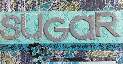
For the title, I used chipboard letters by K&Company -- also purchased on Scrapbuck.com (for a whopping $1.50).  At that price, you can purchase a bunch of them rather than spending a bajillion dollars on a die cut machine, which by the way, requires you to also purchase cartridges for all the different fonts.  Way.too.expensive.for.KeKe.


I also chose to do journaling on a secret tab that I secured by placing it between the silver and blue photo mats (this means when you're gluing the mats together, leave a little space where there isn't any glue so the tab can slide in). 


What's written on the journal tab is between me and my Sugar Pie, but let's have a closeup of that ass-grab one more time for good measure:


Thank you Marsha, for the fabulous gifts and for actively contributing to my scrapbooking addiction.  ;-)  BTW, Miss Hannah absolutely loves them, too.

Now go forth and punch! 

Tuesday, July 6, 2010

Personalized cards make people smile... and that makes ME smile!

So, I know that I've done a previous post about card making... but I wanted to do another one that's a bit more detailed. Matt's stepdad just celebrated his birthday on July 4th (what a fun birth date, right!) and I wanted to make him a personalized card. Frankly, for personalized cards, I like them to be simple and elegant.  And this is my blog, so that's what I'm going to talk about.  

1. Find the paper that you want to use for the card and fold it in half. I like to fold it top to bottom, rather than sideways, because it stands up easier. This step is important because as you're laying out your elements, you want to see how much space you have to work with.

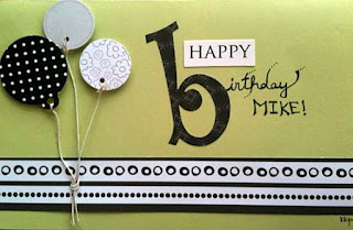
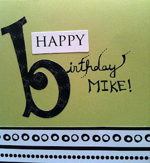
2. Pick a title for your card.  I liked "Happy Birthday"... It's simple and to the point. Matthew is the one who suggested adding Mike's name, for a more personal touch. I told Matthew, "Great suggestion, honey.  Keep it up and I'm going to turn you into a real live scrapbooking machine." He ran away. Anyway, I loved his idea and it definitely made the card. The "HAPPY" is a punch-out from the Colorbok Nocturne collection. The "b" is also Colorbok (XY&Z collection). Both are from scrapbuck.com

***FYI: Punch-out kits are won.der.ful. Why? Because they include tons more than if you just buy an alphabet kit. They come with tags, photo frames, borders, paper embellishments, and fun words to add to your pages. And on scrapbuck they are under $5.00. Can I get a "woo-hoo"?!

I chose to handwrite the rest to give it a personal touch.  Play around with different types of lettering (cursive, all caps, etc.).


3. Decide on some embellishments. I was looking through my stash and saw these circular punch-outs (by Best Occasions - a FABULOUS kit). These punch-outs are typically used for tags, but I thought they'd double as balloons rather nicely. I hunted down some string in the black hole (oops, I mean garage) to finish off the balloon look. Here's a tip when using nylon string: after cutting, burn the edges a bit with a match to prevent fraying. Another tip: when it comes to embellishments, odd numbers always tend to be a bit more visually appealing, as well as using different sizes. 


4. As you can see from the very first picture, I put a patterned strip near the bottom of the card. The strip came from a regular piece of 12x12 patterned paper (trimmed to perfection by my trusty Fiskars)... and I liked how the circles and dots coordinated with the polka-dot balloon. There's no trick to perfectly laying out the elements on a card. You just have to play around until it looks good.  Rearrange things a few times before gluing them down. And if you happen to have someone else around, tell them you'll give them a free high five if they tell you their opinion (a free high five might just be the best gift ever).

5. For the inside of personalized cards, I always like to use a picture of me and the card recipient (so they'll ALWAYS remember my awesomeness). Give the photo some bling by adding a border/frame. The border for this photo came from the same Best Occasions kit.   


6. For the personal note inside the card, add some flair by using a large letter (an "M" for Mike). You can also add some snazzy buttons or borders (I added another black and white strip to the inside of the card at the very top).

7. THIS STEP IS KEY: For the personal note, I suggest using a totally separate piece of paper and cutting it to fit. That way, you can write your message and glue it to the inside of the card (use a glue dot roller cuz it's nice and flat). There's nothing worse than ruining your entire card by writing directly on the inside and messing it up in some way. 

What an amazing creation... and another satisfied customer!  Happy Birthday Mike!!


Do you make personalized cards? What's your favorite thing to add to cards to make them unique?