Happy Monday! One thing I love about photographs is that they jog my memory (I don't like anything about jogging, but I do like anything that helps my memory). And one thing I love about scrapbooking is the showcasing of photographs that would otherwise sit in a box amongst thousands of others.
Our lesson today will be about making photos POP. Photos can do many different things, depending on what you want for that scrapbooking page. You can choose colored and/or patterned paper to actually match the photos, you can select a particular color in the photo and use similarly colored embellishments as accents, or..... drum roll, please.... you can take a vividly colored photo and make it POP even more by using black and white paper.
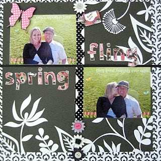
The photos from this page are from Easter. On Easter this year, I felt my *first* big earthquake. A bunch of people from Waters End (the name of our neighborhood, which is much like Wisteria Lane on steroids) had an Easter egg hunt in the park. As the kids were busy finding eggs, the adults congregated in a circle, enjoyed a few cocktails and reminisced about their childhoods. I felt the ground start to move, and I mean really move. I thought to myself, "These damn kids sure are heavy-footed! They're shaking the entire park!" But friends, I'm pretty quick and soon realized that there weren't really any kids in my general area. Then I thought to myself, "These damn drinks are really doing the trick! They're shaking the entire park!" Again, quick KeKe realized there's no way that could actually happen. But the ground just kept on shaking and finally someone said, "Holy cow we are having an earthquake." And my next thought after that was, "Hmmm, I sure do hope the ground opens up and swallows a certain housewife who's sitting across the circle from me." (That's a story for another day.) Alas, the ground did not open up... but I'll tell you what, the reason for my huge smile in the picture above was because I was daydreaming about that housewife falling down, down, down into a hole, never to come out (oh and because I was sitting with my handsome boyfriend).
And so... what better way to memorialize this particular day than with a page that makes those pics pop (lots of "p's" there... sorry, it's Monday). Here were my steps:
2. I selected a black and white pattern that had large flowers to keep with the "spring" theme, and I selected a smaller patterned black and white paper to accent (remember our lesson on large & small patterns?). I trimmed the larger pattern paper and placed it just a bit off center on top of the smaller patterned paper. Sometimes it's more interesting for things to be a little asymmetrical.
3. (Please don't focus too much on this step, as the main lesson here is making photos pop.... here, I'll make the text really tiny.) I wanted the photos to be somewhat grid-like because I already had my title in mind (more about choosing titles in a later post). I wanted the two pics and the two words to all be opposite one another in an imaginary 4-squared box.
4. The bright green of the grass against the black background has fabulous contrast -- but if you imagine it without the colorful title and pink embellishments, it might be a bit boring. I added pink flowers onto the photos and so I thought that would be a good color to use as an accent. *However* when using black and white paper, you can pretty much use any color as an accent. I'd imagine this page would've looked just as good if I had selected green accents, to match the grass.5. For the title, I used some alphabet stencils and cut each letter out. Then I took a silver marker and outlined each letter... again, helping with the "pop" effect. Because the letters have lots of black in them, they may have blended in a bit too much with the black background without the silver outlining.

6. I also used a pre-cut pink butterfly and outlined it in black to have it "pop" away from the green in the photo (and see, I told you I had a big smile!).

7. Add a few more embellishments to top it all off. (I used paper flowers and buttons from scrapbuck.com and arranged them in a straight line to coordinate with the grid-effect of the photos and title.)

And there you have it, perfectly "popped" pictures possessing polished precision with pleasing plastic and pretty paper petals.
Beginner scrapbooking tip: As beautiful as scrapbooking pages are, sometimes the true delight that scrappers take is knowing what went on behind-the-scenes, so to speak, in the photos. This page will always remind me of that earthquake, but to many viewers, they will just see the photos and embellishments. And that's just fine with me. =)
No comments:
Post a Comment
Thanks for leaving a comment!
Note: Only a member of this blog may post a comment.